Through ideation and research, I determined that successful onboarding required building trust in two key areas: the service and the technology.
We would have to convince users that seeing a doctor remotely with Bond is in fact “the smarter way to see a doctor” and that the application will deliver an exceptional experience and keep their personal and medical information secure, all in a matter of seconds. The trust that we had built over time through marketing, community events, and our website would have to be condensed.
This was a challenge that required encoding trustworthiness in the smallest of details. There is no single right way to do this, but here are some of the techniques that were implemented in this design.
Building trust in the service
Introduce a face
Humanizing the experience with a face – or even an anthropomorphised character, à la Duolingo’s Duo the Owl – can help build an emotional connection with the user. This may make the user more receptive, as they’re now answering to a “person” rather than just a program.
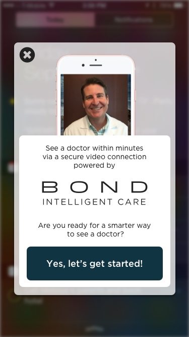
Face? ✔ Direct copy? ✔ Setting expectations? ✔
Use your voice
Whether onboarding is the start of your communications with the user and you’re going for the conversion or you’re simply sealing the deal, you’re still marketing to the user and your copy should reflect the brand voice.
We at Bond like to address the user directly in an accessible but professional tone that establishes both authority and familiarity, so that tone carries through the experience.
Keep the brand prominent
Even if the brand isn’t recognizable enough to be a selling point, presenting the brand well helps establish legitimacy. In this case, it proves particularly important – no one wants to feel like they’re seeing an off-brand doctor.
Anticipate questions
With a high involvement purchase, people are going to have questions. Can I use my insurance? Can the doctors prescribe medication through the app? Anticipating these questions and answering them – directly or implicitly through some well written copy – helps build user confidence and increase conversion and satisfaction.
Even if conversion for your product or service is less involved, there will still be questions. Can I change this setting later? Why does the trial need a credit card? Go through the process with a potential user and see what questions they ask, and then go back and try to pre-empt them.
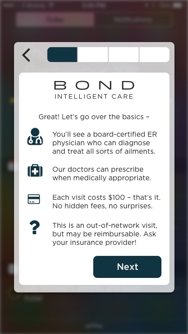
Prominent branding? ✔ Anticipating questions? ✔ Setting expectations? ✔
Set expectations
No one likes feeling that something wasn’t what they expected. Progress bars and foreshadowing copy help the user know what’s coming next. This keeps users feeling in control of their experience and reduces the “wait I didn’t mean to do that” refund requests.
Trust in the technology
Demo what you can
Nothing proves something works better than a demo can. Launching the user’s camera before finalizing the purchase is a good way to preview and familiarise the user with the video call functionality and reduce any anxiety surrounding the technology.
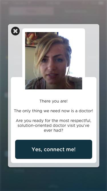
Demo? ✔ Direct copy? ✔ Setting expectations? ✔
Provide validation
Pre-empt feelings of doubt or anxiety by giving them feedback throughout the process. Did something work? Let them know! Did something not work? Show them what didn’t. Users will feel more at ease with the sense of control afforded by this validation.
Prime your permissions
Prepare the user for the permission request by telling them why you need it. And to avoid bombarding them with pop-ups, allow them to initiate the permission pop-up with a button or checkbox. Once again, let the user feel in control of the experience.
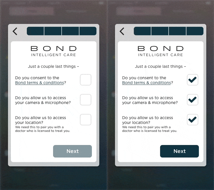
Permissions priming? ✔ Validation? ✔
Leverage existing trust
To get to your technology, the user is probably using some sort of technology they trust. Build off of that trust. For example, rather than taking over the full screen, the SDK is designed to launch as a modal to feel integrated into the application that is using it.
Reaffirming trust through offboarding
Building trust in the onboarding process gets first time customers, while a well-designed offboarding process gets satisfied and repeat customers. It also provides an opportunity to ameliorate any issues that may have occurred during the visit itself.
An excellent way to implement this is by opening an immediate feedback channel. Uber’s rating system, while flawed in many other ways, is a great example of producing targeted feedback. It first asks the user for a quick 1-5 star rating, then generates targeted questions to get better feedback.
The SDK draws inspiration from Uber’s successful design, using the initial rating to determine whether to ask for positive feedback or targeted criticism. If the user’s experience was positive, we’ll ask them to share it with friends. If not, we’ll offer to contact them to amend the problem in attempts to rebuild the trust lost in the interaction.
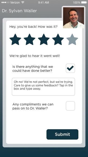
Offboarding? ✔ Targeted feedback? ✔
If you have Sketch, you can download the full project here. If not, you can still view the screens in this PDF.