
Hey Agents is a responsive Angular web-application using the custom Hey Agents REST API built with Serverless and AWS Lambda. From a technical standpoint, I created the product MVP and expanded the API functionality. From a design standpoint, I conducted product and user research, crafted the user flow and designed the interface. Product requirements and their implementation were largely self-managed, using agile methodologies to keep the project on track.
In other words, I wore a lot of hats on this project. So to keep this case study contained, we're going to focus on the design and development of two critical components of the application: agent signup and agent profiles.
Agent Signup
The Hey Agents founders feel that real estate agents have gotten the short end of the stick with competitors – they pay absurd referral rates, the interfaces leave much to be desired, and the property owners are by far the focus of the marketplace.
A slick signup packed with user friendly features is meant to show agents right off the bat that the platform values them as users.
A demonstration of the agent signup
Agency autocomplete
Autocompletes are great at reducing friction and standardising user inputs, so wherever it can, the appliation sources data to make the user's life easier. The Google Places API already has a place type 'real_estate_agency', however, Google's Place Autocomplete doesn't allow for that level of granularity. So that's where we get creative – this custom implementation uses Typeahead and Bloodhound to generate autocomplete options from a Google Place Search using the provided input.
Suburb selection
Allowing agents to select suburbs during signup illustrates the value the platform offers, and this map interaction visualises the suburbs selected, making clear the boundaries that the agent is agreeing to. The map uses publicly available suburb boundary data converted to KML and imported into Google Fusion Tables to create Fusion layers that sit on top of the map.
Agent Profiles
There's a lot that might come into play in a property owner's decision – an agent's past sales, selling strategy, client reviews, personality... And since an owner might be comparing several agents at once, this information needs to be easily scannable. Through plenty of competitor research, referencing successful profile designs, and applying tried-and-true design principles, we reached the design below.


The mobile version of the agent profile
The most important information is shown first – agent name and professional details, photo, commission, rating, key CTAs, and quick links to the rest of the information. Please note that in this static demo, quick links are not functional and the focused link does not update as it scrolls.
Through this, we establish (1) who the agent is, (2) what information the user can expect on the page, and (3) what their purpose on this page is. As the user scrolls, this key information is pinned to the top and bottom of the screen for easy access.
We provide the user with plenty of data – but all of the data in the world doesn't mean anything if the user doesn't see the relevancy it has to them and their needs.
Contextualising the data
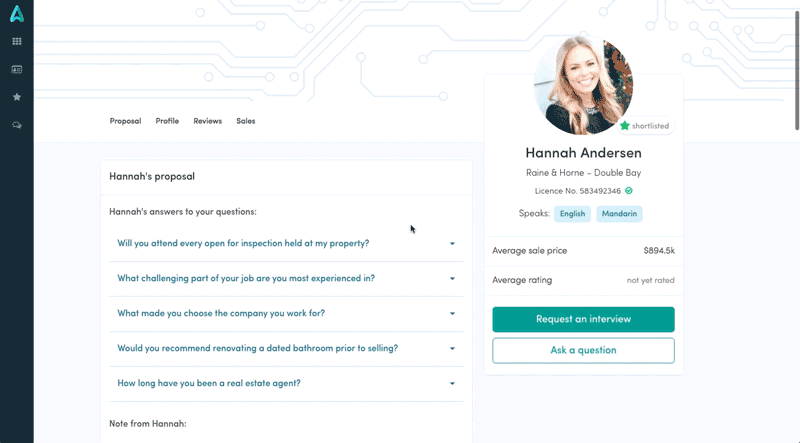
In initial designs, we gave users an open field during registration to brief the agent. But this is a scenario in which the user has no context – they've probably never briefed an agent before. Even I wasn't sure what I would type in that input.
Our solution? We removed the big empty text box and gave users a series of questions to select from, such as 'How long have you been an agent?' or 'How long do you expect my property to be on the market?'. With that ball rolling, an open field to add an additional question seemed to be a much more natural prompt.
This change also created a context for the agent's to respond to the brief in an organic way. Answering questions is a more natural exchange, and gives the agents insight into what's most important to the seller. This allows them to tailor their proposal based on what's relevant to the user – a win-win for both sides of the market.
Context is also critical when it comes to sales history – if an agent has sold 100 properties but not a single 2 bedroom house, that's important information that should be easily accessible to someone trying to sell a 2 bedroom house. Our solution? A series of smart filters that adjust the data based on properties similar to the user's.
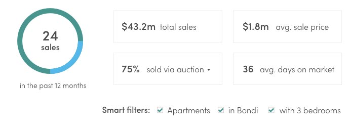
A closer look at the smart filters, which include the user's property type, suburb, and number of bedrooms
Designing for desktop
In many ways, profiles lend themselves well to a mobile format – the smaller screen size reduces clutter and the limited width keeps text at a nicely readable line-length.
It's immediately apparent that a column layout will be necessary to reduce the line-length. However, a 1:1 column layout can begin to look cluttered with as much text as the profile would have. A 2:1 split creates a size hierarchy that can make the content in the smaller column seem subsidiary. In this case, where all of the sections share a similar level of importance – and generally a large amount of text – it just didn't make sense to split the main content in such a way.
However, a great way of making that subsidiary column seem more important is through fixed positioning. The content is smaller, but important enough to never leave the page. This technique with a full card of agent details that simplifies on scroll.
A demonstration of the desktop layout and scroll animation