I liaised with the Associate Director of IT Innovation to ideate, design, and develop a prototype that met the technological specifications and creative expectations I was given. However, during this process, it became evident that a gesture menu is not an ideal method of ordering. Everyone was happy with the prototype, and it performed well at the conference, but as I had come to expect, businesses weren’t clamoring to implement it themselves.

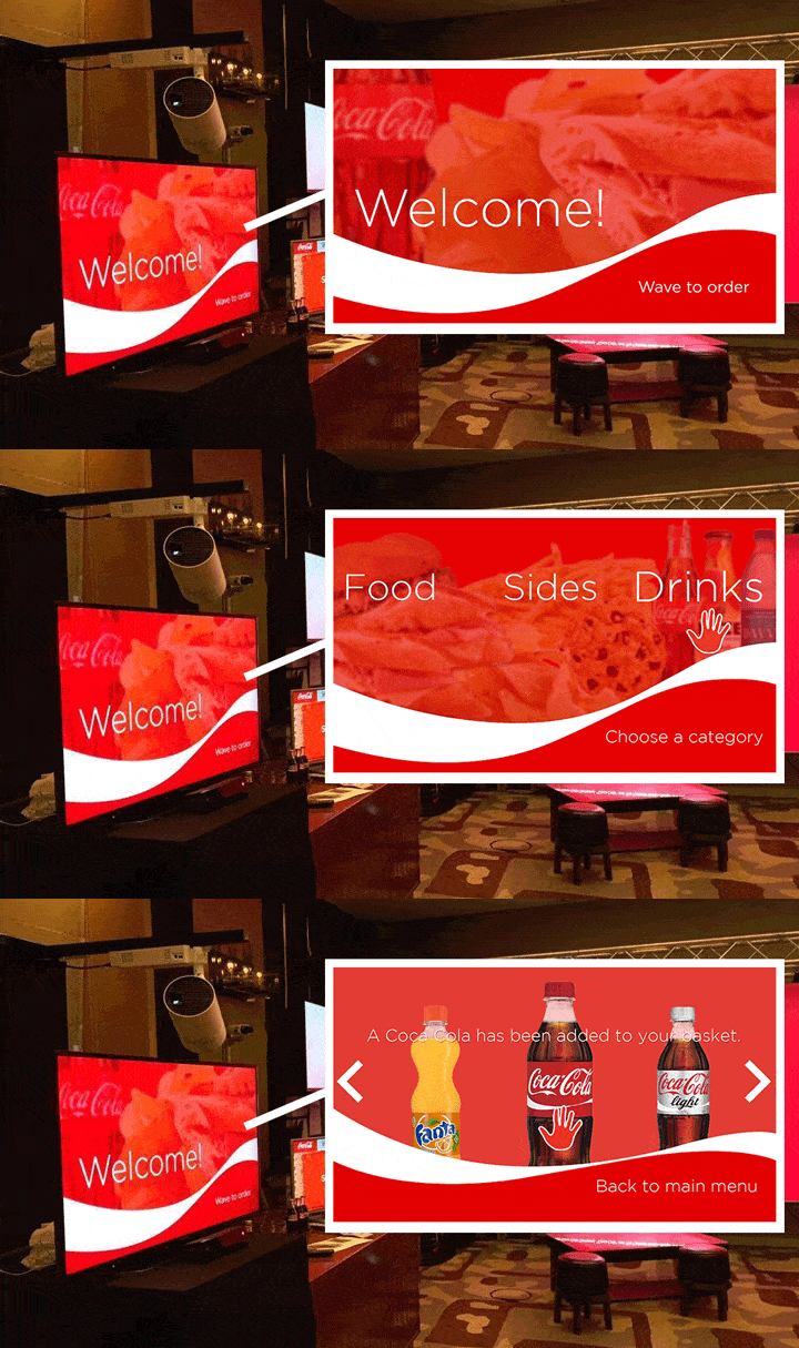
The final product on display in Berlin with screenshots of the key interactions
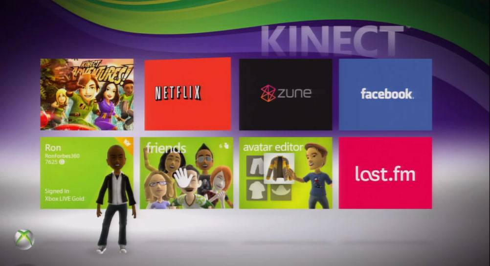
Ultimately, the solution neither simplified the ordering process nor introduced a truly unique interactive experience. The most interesting interaction is the wave to begin – an inviting way to initiate an interaction as it mirrors how one might start a friendly conversation. After this exchange, however, the menu essentially becomes a large computer screen with the user’s hand movements controlling the cursor. This is largely the approach that even Microsoft had been using with their Xbox menus until they scrapped the concept entirely, citing the lack of intuitiveness and the ease of alternative controls.

Microsoft no longer uses this "hand as a cursor" approach
So the question is: why don’t gesture controls lend themselves well to this sort of menu-based interaction? Why was it so hard to make them work?
Imagine yourself walking into a café. You’re waiting in line and perusing the menu, and you get up to the counter to order your food. Are you waving your hands around? Dancing? Moving much at all? Probably not, and therein lies the problem. Adding movement to an interaction that currently does not necessitate much movement is creating a problem that never needed to be solved.
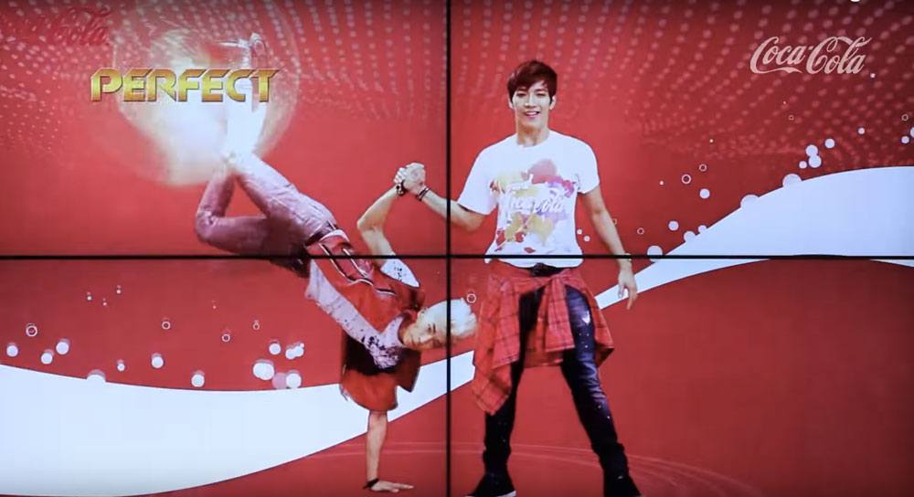
That being said, there have been some excellent experimental uses of the Kinect, such as a Coca Cola vending machine in South Korea that gave out free bottles in exchange for some sick dancing. For a playful publicity stunt, the Kinect technology worked excellently, but this experience certainly wasn’t designed to replace an everyday vending machine.

A playful publicity stunt using Kinect technology in South Korea
There was a fundamental flaw in the design process for this project – and it was that the wrong question was being asked from the very beginning.
Rather than asking how we could include gesture controls in the ordering experience, we should have asked how – or if – the experience could be improved by these controls. It’s a small but important distinction. The first question results in a final product such as this one – a functioning experience that no one wanted or asked for – while the second question opens other doors. Kinect technology could perhaps make the ordering experience more playful and more memorable, but certainly not more practical.
This project was where I truly learned the importance of asking the right questions to design the best results, and it’s a lesson I have incorporated into my design philosophy ever since.