From booking…
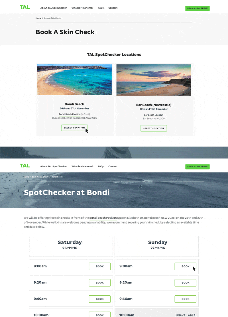
The project required a microsite that would allow users to book a skin-check appointment with one of the several medical professionals on-site. The user would need to select a location, date, and time, as well as provide personal information to both identify them at the appointment and provide reminder email and text notifications.

A look at the custom integrated booking process
By liaising with TAL designers and following brand guidelines, the resulting design seamlessly integrated with TAL’s existing online presence.

The mobile version of the SpotChecker microsite home page
Meeting brand expectations for the site was the easy part – implementing a booking solution to meet TAL’s security and performance standards was much trickier.
By leveraging existing booking technology and integrating that into a static and scalable AWS implementation with top-of-the-line SSL encryption, the solution passed the security audit and the campaign ran without a hitch.
… to beach
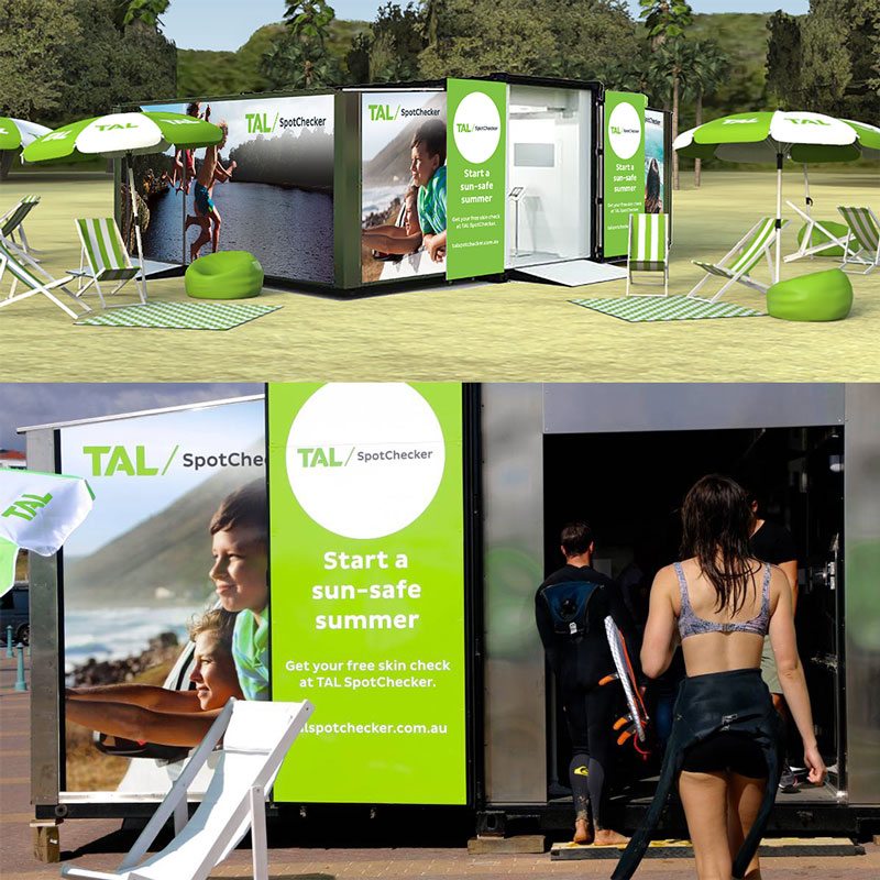
So the microsite has sent people to the beach – now how does the brand experience continue? With a custom set-up and lounging area. Through several iterations with the client, the final container design carried the TAL brand to the beach, using high-res photos and SVG to look great at full-scale.

The in-situ mockup and the design in-action