The subscription back-end
While subscription boxes are a bit of a trend these days, there aren’t many robust off-the-shelf e-commerce solutions that can accommodate trickier subscription scenarios. Some of the major players, such as Shopify, don’t even have built-in support for recurring purchases in the first place. For a business like Whisky Loot that needs to (1) keep a record of the whiskies in each box in order to offer suggestions, and (2) change these whiskies on a month-to-month basis, a custom solution was in order.
This solution was achieved through LemonStand, a highly customisable e-commerce platform with flexible recurring purchase settings. Through a combination of built-in features and custom API development, Whisky Loot is able to keep on top of what each customer has tried – critical knowledge for the Whisky Loot roadmap.
The Whisky Loot experience
With the backend solved, the next step was creating a branded experience for the user to purchase and manage their subscription.

The mobile version of Whisky Loot's homepage
Through referencing brand and tone-of-voice guidelines, I created a visual style for the website that’s distinctly Whisky Loot. The design strove to be less masculine than most whisky imagery, using cooler tones, pops of colour, and less organic texture (looking at you, wood panelling).

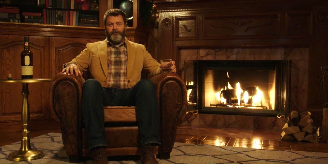
Lagavulin's Nick Offerman ad is a prime example of masculine whisky advertising
The design also uses a lot of natural imagery, typically mountains, to create a sense of aspiration and exploration. The copy simultaneously hints at a destination – finding your favourite whisky – but celebrates the delicious journey that Whisky Loot will take you on to get there. Whisky Loot isn’t just giving you whisky, it’s giving you knowledge of whisky – something much more valuable.

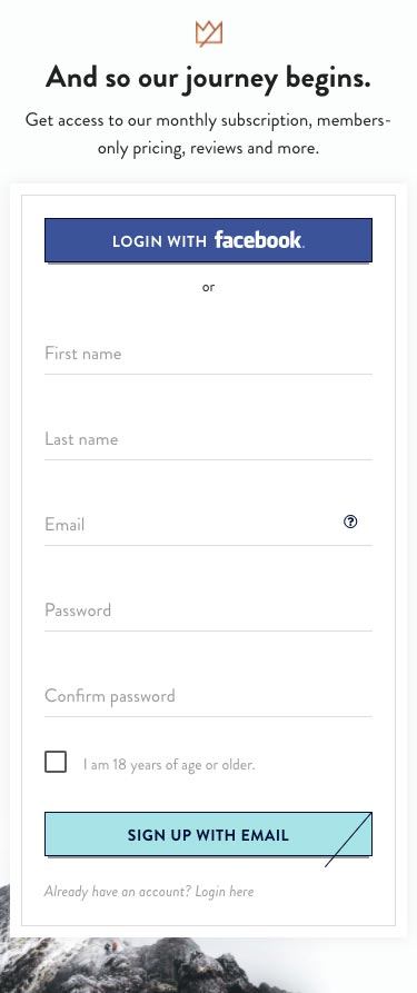
The Whisky Loot signup page. Mountains? ✔ Aspirational copy? ✔
For a beverage that has long had an air of exclusivity – to women and amateurs alike – the design is meant to feel open, inviting, and inclusive, yet premium.
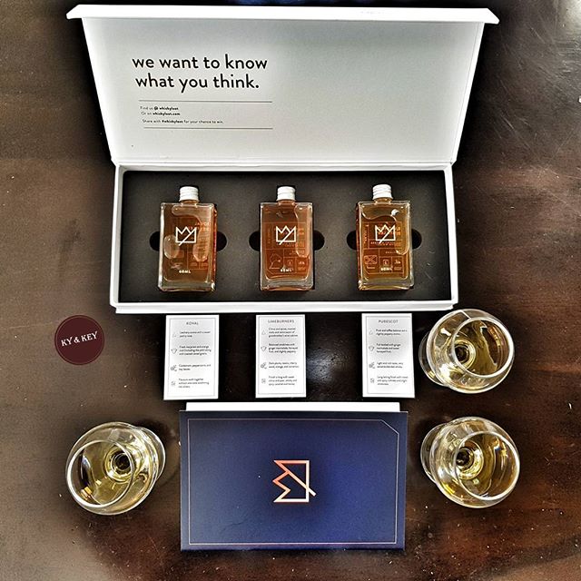
This feel continues through to the packaging, with a crisp white box and gold foil details. The detailed product labels and notes, as well as the included tasting-note booklet, continue to emphasise knowledge, learning, and growth.

A great product flat lay taken by @kyandkey
To see the full site or to start your whisky journey, visit whiskyloot.com.